Volume 3
2013
Annual
Julie Nichols
This is one of the most attractive lit mags I’ve viewed. For the astonishing price of five dollars, you can hold in your hands this substantial (eight-inch-by-eight-inch) volume with a technologically progressive cover and an extremely pleasing page design, whose innards are divided between visually striking color art, outstanding poetry, provocative interviews, and stories so good from the first line you want like crazy, but can hardly stand, to reach the ending.
This is one of the most attractive lit mags I’ve viewed. For the astonishing price of five dollars, you can hold in your hands this substantial (eight-inch-by-eight-inch) volume with a technologically progressive cover and an extremely pleasing page design, whose innards are divided between visually striking color art, outstanding poetry, provocative interviews, and stories so good from the first line you want like crazy, but can hardly stand, to reach the ending.
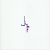
Reunion is a product of the School of Arts & Humanities, the home of Creative Writing at the University of Texas at Dallas, a “forward-thinking interdisciplinary unit offering “degrees that cross the normal boundaries between art and science, language and literature, technology and philosophy.” Dedication to what’s outside-the-box but integral-to-what-matters obviously drives the high quality of this magazine. Start with the cover. It’s dramatically simple (an angular “J” set just above and to the left of a techno-font “F” in the center of the stark white cover), until you download the Aurasma app to your mobile device, access the purple swirl, and view the blossoming new shapes on the full interactive cover on your device’s screen—complete with music. A great concept!
Inside, the text’s font is a little larger than usual, the leading a little wider, so that the white space frees the eyes for reading comfort. It’s not a “large print” volume—just easier on the eyes than if it were 12-point font on 14-point leading. In any case, the eyes like it. The pages are square, the margins generous, every page of text a readable feast, even before you get to the content. Kudos to the designers for this artfulness.
Content is equally exceptional. Two pieces by Rebecca Morgan Frank set the tone for the poetry. “How to Build a Rocket” and “Bird’s Eye” take us off the planet, into the stars, reminding us “Which came first, this / rocket or that / moon? Come on, / it was the rocket / maker . . .”
Jeffrey C. Alfier’s “Black Hawk Crash, Tal Afar, Iraq, 2006,” David Breeden’s “Elegy for Kevin Joe Eldridge,” and Matthew J. Spireng’s “Madison Buffalo Jump, September” all evoke, with Frank, images of life’s fragility (“a soldier at a Mosul firebase kept trying / to resurrect your voices, halted in the quiet / brutality of radio silence,” and “It isn’t the mortality / pulls me up but / missing your life / so caught in mine,” and “If the buffalo had souls, they are / here, the cliff, the steep slope, boulders / and browned grasses inhabited again”). So does Marissa Schwalm’s vulnerable “Things I Don’t Tell My Mother,” proving that poets understand survival mechanisms better than therapists.
The interview by Sarah Da Rocha Valente with poet Campbell McGrath thus resonates especially well. Among many tidbits of valuable advice for the reader and writer of poems is this on endings:
[The] goal for a poem is to end with closure that is completely satisfying to the reader. Closure has many possible types, among them narrative (what happens), musical (rhyme, assonance, etc.), structural (syntax, refrain, etc.), argumentative (what conclusion is to be drawn), and formal (crafting the artifact perfectly). Great poems often combine several of these strands, and those poems tend to conclude with resonant and complex endings.
The interview with novelist Ben Fountain is different, of course, but equally strong, revealing his take on the National Book Award for which he was nominated in 2012.
Successful prose, both fiction and nonfiction, is well represented in this issue of Reunion. The voice of the adolescent narrator navigating a crush on the Kessler’s jewelry clerk in Maryse Meijer’s “Shop Lady” is perfect, comma splices and all. Daniel Tyx’s essay “Vaquero Days” begins with the doleful (but delightful) line, “in spite of mounting evidence to the contrary [I] still believed that I could accomplish anything with a little effort.” More evidence to the contrary accrues as he tries to become a vaquero in a South Texas convention event, where real vaqueros trample his delusions.
Moira Muldoon’s mini-essay “Nerts” lovingly recalls a family’s bonding over a card game. And a number of beautiful translations—of Natalia Carbajos’s Spanish poems by Scott Hightower and of Margarita Meklina’s Russian fiction by Krystyna A. Steiger—round out the issue.
The work of no fewer than ten visual artists is featured here, beautifully reproduced in full color. Oh—except the black-and-white inkwash photographs precisely “re-developed” by Gunnel Wåhlstrand or Bill Haveron’s “Reverse Osmosis,” a pen-and-ink “metaphysical scratchpad” of “magical incantations against forces simultaneously seen and unseen.” Haveron’s artist’s statement is as whimsically Bosch-like as his drawing. The rest of the visual art all showcases this breathtaking range—Jeff Gibbons’s photograph “In Honor of the Memories of My Father and Mother,”centerpiecing a table, one wheeled leg evoking an old-fashioned sewing machine, with a well-used bowling ball arranged on top; Sarah Pedigo’s painting “Front Porch” accompanied by Liz Robbins’s delicate prose poem “Can You Hear Me?” (“On the front steps, the family web sinewy, mired, cryptic.”); and Regine Ramseier’s installation of two thousand dandelions hanging from a ceiling.
There is much more. Get the issue while you can. It’s a triumph on many levels.
[www.utdallas.edu/ah/reunion]